¶ Interface Overview
 The
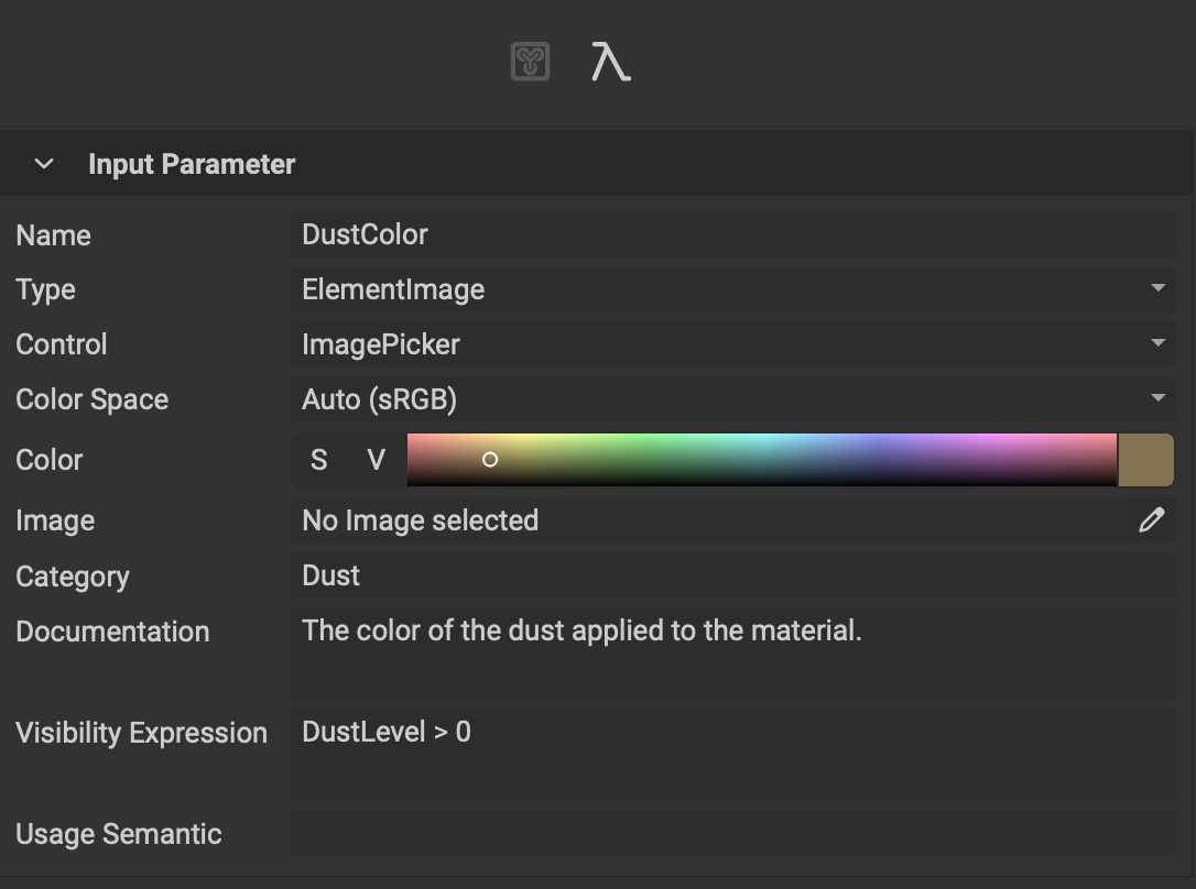
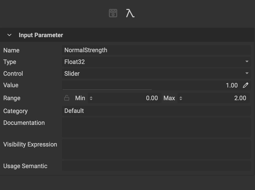
The Graph Variable Editor's list of controls adapts depending on the item selected in the Canvas. The following is an overview of the available controls.
- Name: The name of the variable.
- Type: The variable's type.
- Control: The UI control widget used to manipulate the data. Depending on the variable's type this list will change based on the available compatible widgets.
- Color Space: The colorspace used if the variable type is an ElementImage.
- Color: The default color/value used if the variable type is an ElementImage or ElementImageGray.
- Image: The default image used if the variable type is an ElementImage or ElementImageGray.
- Value: The default value of the variable.
- Rotation Start: The location of 0 degrees if the chosen widget is a VectorAngular.
- Rotation Direction: The rotation direction of
ClockwiseorCounterclockwiseif the chosen widget is a VectorAngular. - Range: The minimum and maximum range if the chosen widget is a Slider.
- Category: The category assigned to the variable. Input parameters with the same category will be grouped together in the Graph Object Editor and can be combined together using Link Category Mode.
- Documentation: Documentation text for the variable. This can be used to provide the user with information about the effect on the resulting image or graph. The text appears in a tooltip when hovering over the variable in the Graph Object Editor.
- Visibility Expression: An expression used to hide an input parameter based on a condition.
To learn more about visibility expressions or VisEx, please read our dedicated article: Visibility Expressions.
- Usage Semantic: A semantic that can be used to perform additional soft validation on input parameters. If the semantic does not match, a warning will be emitted but the graph will still execute.
To learn more about the variables that can be edited in the
Graph Variable Editorincluding their creation, please read our article on the Graph Object Editor.